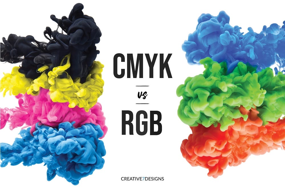
[vc_row][vc_column][vc_column_text]Color can dictate our emotions, influence productivity, and even encourage certain actions. Learned from a young age, ROYGBIV has claimed a powerful stake in our human experience. This is why, in the marketing industry, which relies heavily upon understanding peoples’ perceptions, experiences, and anticipated decisions, we’ve taken an interest in the psychological power of colors. Basically, we really want to know: what’s your favorite color?[/vc_column_text][vc_column_text]But it’s more than preference of course. In one of our latest blogs on the psychology of the color green, you’ll read that colors can convey particular responses in each of us. They have the power to change our mood, our associations, our pursuits, and so much more! So, as a business owner, it’s important to consider how a color might influence your customers’ impression of your services and products. And as you do so, be sure that your chosen colors are depicted with complete accuracy, no matter your medium.[/vc_column_text][vc_column_text]Imagine the differences in the many hues of yellow. On one end of the spectrum, you get a dull and pale yellow. On the other is one that is more highlighter-esque. And while neither will likely appeal to your design endeavors, take note of these colors’ differences in meaning. Even subtle changes in the shades of a color can convey new emotions or associations. So, whether you create print or digital design, be sure that your colors are seen as you intend. This is where the terms RGB and CMYK take a significant role.[/vc_column_text][vc_column_text]RGB and CMYK represent the two major color systems used in digital and print design. They are distinguished by the colors used in computer, TV, and mobile screens and those that can be printed on a lighter background. And it is important to understand their differences. If one is misused, the colors used in your design will deviate from that which you intended. Let’s look at the two individually to understand how each are composed and when they should be used in design work.[/vc_column_text][vc_row_inner][vc_column_inner width=”1/2″][vc_column_text]RGB: These letters stand for red, green, and blue: the colors represented in digital screens. Images on your TV, phone, and computer are composed of millions of pixels, each falling into one of these three subpixel colors. These can be mixed in many ways, creating thousands of different combinations and producing every other color you know and love. And when all three are added together, they’ll create white. This property deems the RGB system an additive color model.[/vc_column_text][/vc_column_inner][vc_column_inner width=”1/2″][us_image image=”10059″ size=”us_604_600_crop”][/vc_column_inner][/vc_row_inner][us_separator][vc_row_inner][vc_column_inner width=”1/2″][us_image image=”10061″ size=”us_604_600_crop”][/vc_column_inner][vc_column_inner width=”1/2″][vc_column_text]CMYK: In contrast, CMYK is a subtractive color model which creates white with the absence of its colors: Cyan, Magenta, Yellow, and Key (which is better known as black.) This is used for all printed materials, from tri-folds to photographs. When you print a design, you’ll start with a lighter colored background, usually white. Then, layers of several different colors are added until the image you’ve created is finalized. This image is made up of tiny dots. And with more overlap of these dots, the darker that part of the image will appear.[/vc_column_text][/vc_column_inner][/vc_row_inner][us_separator][vc_column_text]
As You Design:
[/vc_column_text][vc_column_text]Most design software is pre-set to the RGB color system. However, if you know that your design will be applied to printed materials, be sure to switch this setting to CMYK. And if you’re designing for both mediums in the same project, it is best to start with CMYK, print your design, and then switch to RGB for your digital version. Doing so will produce a closer match in colors.[/vc_column_text][vc_column_text]Accurately depicting your intended colors and their exact shade should be central to your design work. Even slight variations can alter its message and the resulting reaction you hope to achieve. So, as you design, keep in mind the value of colors and the power of even subtly different hues.[/vc_column_text][vc_column_text]And if you’d rather leave the design work to us, do not hesitate to reach out to the C7D team for all of your design needs! We are professional creatives, ready to handle everything from logos to website design. Partner with us for the best shade of your brand![/vc_column_text][/vc_column][/vc_row]


