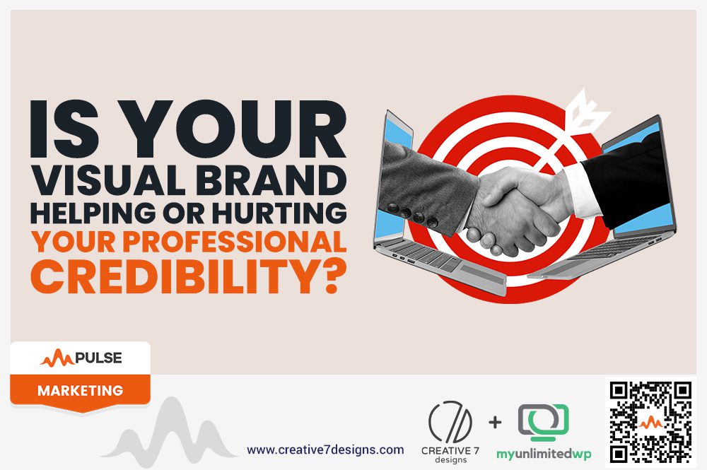
Overview: First impressions matter. Discover how your visual brand — logo, colors, fonts, and design — can boost or break your professional credibility (and how to fix it fast). Read on!
You’ve got the skills. The experience. The track record. So why aren’t you standing out?
Here’s a tough truth: if your visual brand doesn’t reflect the quality of your work, it’s working against you — not for you. And in today’s digital-first world, your visual identity is often the first thing people judge — before they read a single word or pick up the phone.
Whether you’re a law firm, creative agency, consultant, or small business, your visual brand speaks volumes. The question is: what is it saying?
Let’s unpack how your visual branding could be helping — or quietly hurting — your credibility.
What Exactly Is a Visual Brand?
Your visual brand is more than just a logo. It’s the entire look and feel that clients and prospects see and interact with:
-
Logo and iconography
-
Typography (fonts and how they’re used)
-
Brand colors
-
Photography and imagery style
-
Website layout and user interface
-
Business cards, email signatures, social media graphics
Together, these elements create a visual language that tells people who you are, how you work, and what kind of experience they can expect.
Red Flag #1: Your Brand Looks Dated or Generic
Are you still rocking that logo you made in 2011 using Microsoft Word and clip art? (No judgment — we’ve seen it all.)
If your branding feels old, templated, or inconsistent, it sends the wrong message:
-
“We don’t care about presentation.”
-
“We’re not evolving.”
-
“We’re not investing in our business.”
That doesn’t build trust. It builds hesitation.
The Fix: Update your brand with a modern, professional refresh that aligns with your industry and your personality. Bonus points for a cohesive brand guide that outlines your colors, fonts, and visual do’s and don’ts.
Red Flag #2: There’s No Consistency Across Platforms
If your website, business cards, and Instagram posts all feel like they belong to different businesses… you’ve got a visual identity crisis.
Clients crave consistency — it creates a sense of professionalism and reliability. Inconsistency, on the other hand, creates doubt.
The Fix: Audit your brand assets and unify them. That means matching color palettes, fonts, logo usage, and even your tone of voice across every platform. A strong brand system builds familiarity — and familiarity builds trust.
>> Related Reading: How to Resolve Your Brand Identity Crises
Red Flag #3: Your Design Feels Off for Your Audience
Sometimes, brands miss the mark not because they look bad, but because they’re not aligned with their audience. A playful, bubbly design might work for a children’s toy brand — but not for a corporate law firm.
The Fix: Revisit your ideal client. What do they expect to see from someone they trust? Elegant and clean? Bold and innovative? Make sure your visuals speak their language — not just yours.
So, Is Your Brand Helping or Hurting You?
Here’s a quick gut check:
-
Do people often say “I love your branding!” or do they say nothing at all?
-
Are you proud to share your website and materials?
-
Does your visual identity match the level of professionalism you bring to your work?
If you’re unsure — or worse, if you know the answer isn’t great — it might be time to invest in a strategic rebrand or refresh.
Final Thoughts
People decide whether to trust you in seconds. Make those seconds count.
A strong visual brand doesn’t just look good — it builds instant credibility, communicates confidence, and opens doors to better clients and bigger opportunities.
So, is your visual brand helping or hurting you?
If it’s time to level up, we’re here to help you make that first impression unforgettable.